CHASM-Website-Design.jpeg

Website Design

I have created unique websites for national organizations, flexible templates to be applied to over 100 local websites, and with attention to providing a great user experience, every time.

CHASM ARCHITECTURE


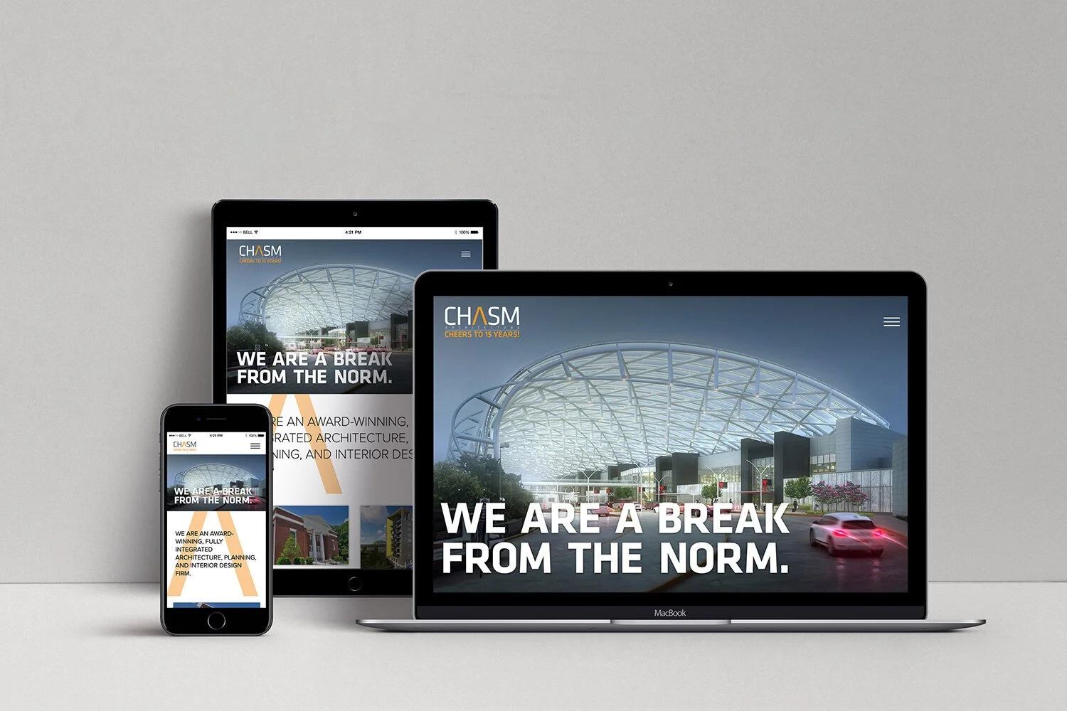
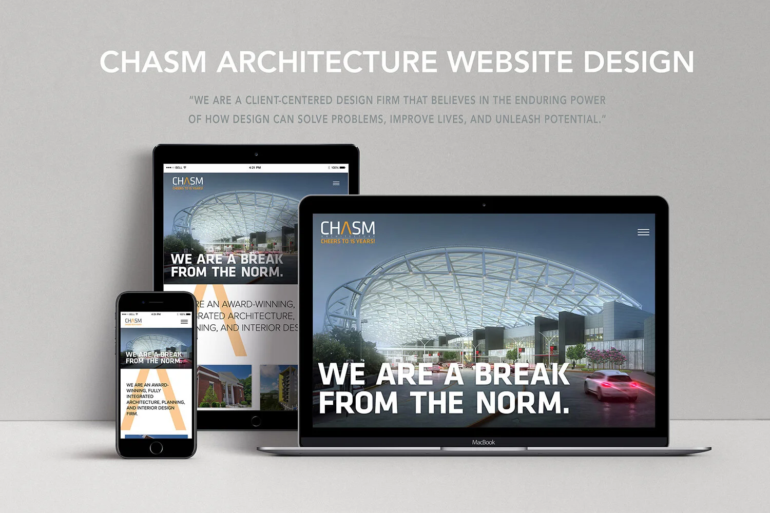
CHASM Architecture is a rapidly growing architecture, planning, and interior design firm based in Atlanta, GA with locations throughout the Southeast. The firm is known for being a “break from the norm” in both design process and client approach, so I was tasked with redesigning the website to meet the following goals:

  • Showcase CHASM’s work in a dynamic way,

  • Improve the navigation and flow of the content,

  • Be easy to update and meet accessibility needs,

  • And to think outside the box in design to adapt to future needs.

The team decided early on in the process to work off of a Wordpress platform, since that was what was most familiar to the staff. I designed a custom site template that was tailored to CHASM’s needs. Every page was built with Search Engine Optimization, mobile-first design, accessibility, and flexibility in mind.

The result was a 232% increase in site traffic, positive client feedback, higher visibility of projects, and an increase in retention.

 
CHASM-Website-Design.jpg

SALEM SURROUND


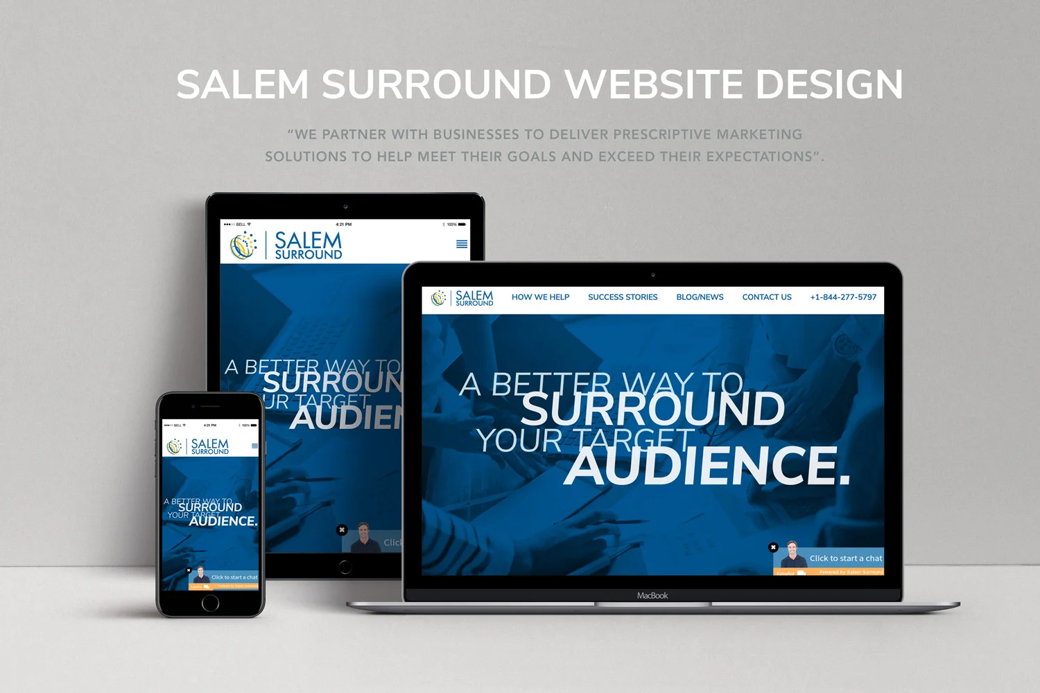
The client created a business that would serve as a marketing solutions provider which would also have many locally-based iterations of the site throughout the country. Looking to shake any reputation of being stuffy and outdated, they needed a clean, modern site that had high visual impact to instantly catch viewers attention and made it clear that they could deliver on the products they were selling. Utilizing bold colors and leading lines, we created a site that introduces the client in a way that reflects their talent.

 
Salem-Surround.jpg
 

I began the project by meeting with the client to discuss the direction and content areas of the site in order to gain direction on how to build a scalable, long-term web solution. The goal was to envision Salem Surround as a modern, relevant, and engaging brand and provide a better representation of the company.

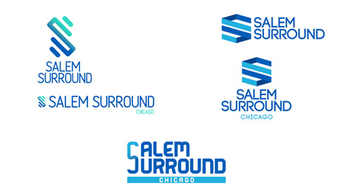
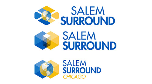
We worked together to create a brand package that reflected the parent company but also gave an updated look and feel. We then utilized it across company collateral by creating branded items such as business cards and shirts.


Utilizing a custom CMS, I worked in conjunction with developers to create a user-friendly interface that is fully-responsive and has unique aspects that draw viewers down the page through each highlighted content area. The page smoothly jumps as you scroll in order to highlight each available feature with angular leaders, micro-animations to create interest, and a healthy dose of white space to help keep the page feeling fresh. We went through multiple design changes in order to hone in the color scheme, layout, and target the content more effectively.


Since this site would need to be iterated across multiple markets across the country, I focused on giving each page a space to feel like it has a local flair without having to reinvent the wheel for every new site. Each local website features a custom logo and header image to reflect their unique site, while maintaining brand integrity by retaining the same color scheme and overall layout of the page. This is further localized by providing a chat feature on the home page that allows viewers to reach out directly to ask any questions.